Chart Analysis
Visual chart analysis is one of SingWork's core data processing modules. Based on user-uploaded raw data files, it automatically performs data computation, chart generation, and business insight extraction — allowing users to quickly understand data distribution and trends through intuitive visualizations, without manually configuring Excel or writing code. It is the "visualization assistant" for data-driven decision-making.
Core Functionality Flow & Experience
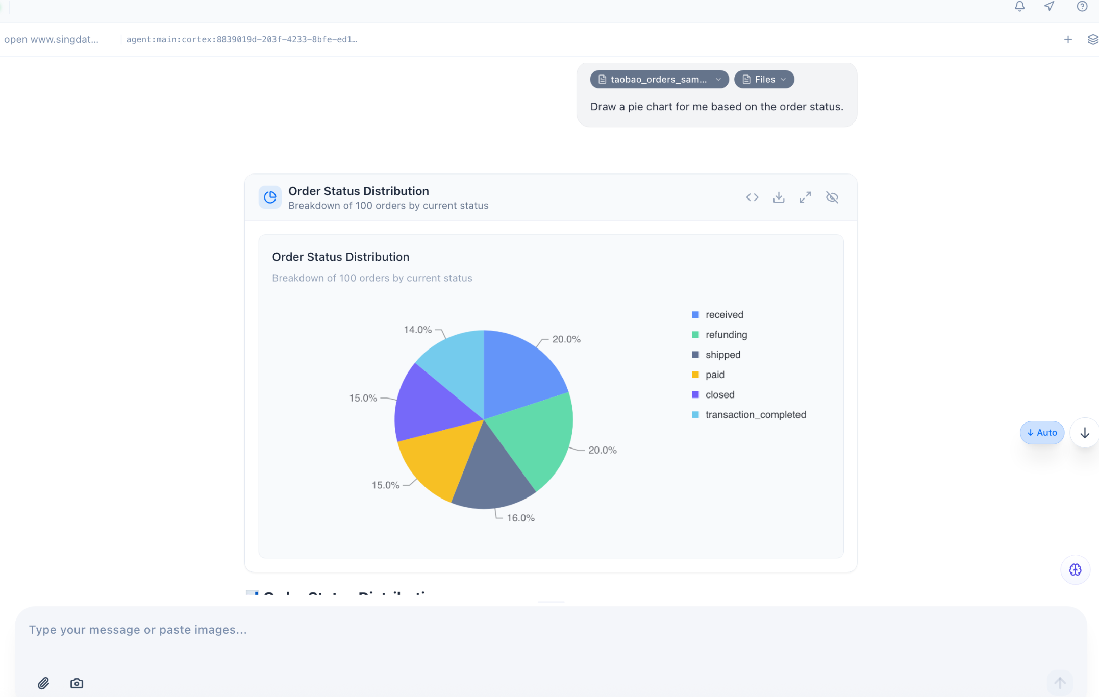
The order status analysis example clearly shows the full flow of this feature:
- Automatic Data Association & Computation — Based on the user's uploaded order data file, SingWork automatically reads and aggregates the data. No manual filtering, pivoting, or percentage calculation needed — it directly completes grouped statistics by order status dimension.
- One-Click Professional Chart Generation — The system automatically selects the appropriate chart type based on data characteristics (e.g., for order status distribution, it automatically chooses a pie chart to show proportions), and completes chart styling and annotation — including clear legends, data labels, titles, and descriptions.
- Simultaneous Business Insight Generation — Business insights are automatically output below the chart (e.g., "Delivered and Refunding each account for 20%; the refund rate is high and warrants attention"), translating data results into directly actionable business recommendations for a one-stop "chart + interpretation" delivery.
- Flexible Chart Interaction & Export — Supports chart zoom, download, and sharing. Users can directly use generated charts in reports or meetings without additional processing.
Core Capability Highlights
1. Intelligent Chart Matching & Auto-Generation
-
Scenario-Based Chart Recommendations: Automatically matches the appropriate chart type based on data type and analysis goal:
- Proportion data (e.g., order status distribution): Pie chart / donut chart preferred
- Trend data (e.g., monthly sales changes): Line chart preferred
- Comparison data (e.g., sales by category): Bar chart preferred
- Relationship data (e.g., purchase frequency vs. avg. order value): Scatter plot preferred
-
Zero-Configuration Generation: No need to set chart styles, colors, axes, or legends — the system automatically applies professional styling for clear, readable charts.
-
Automatic Data Label Annotation: Key data is displayed directly on the chart (e.g., percentage labels in the example) without manual addition, improving information delivery efficiency.
2. Automatic Business Insight Extraction
- Business-Oriented Interpretation: Goes beyond generating charts — outputs business insight conclusions based on chart data, transforming raw numbers into actionable recommendations and helping users quickly identify anomalies and opportunities.
- Anomaly Detection Alerts: Automatically identifies key anomalies in the data (e.g., the high refund rate flagged in the example) and proactively alerts users, lowering the analytical barrier.
- Structured Conclusion Output: Presents core insights in concise bullet-point format for quick information extraction, ready to copy directly into reports.
3. Flexible Analysis via Natural Language
- Command-Driven Chart Generation: Users can specify analysis needs directly in natural language, e.g., "show order status distribution as a pie chart" or "generate a monthly sales trend line chart," and the system automatically generates the corresponding chart.
- Multi-Dimensional Drill-Down: Supports follow-up questions based on the current chart, e.g., "what are the main product types in refund orders?" — the system automatically generates new charts and analysis for multi-dimensional exploration from overview to detail.
- Context Memory Analysis: Based on the SingMemory module, the system remembers previously uploaded data and analysis history, so users can issue new analysis commands directly without re-explaining data sources.
4. Full-Chain Data Visualization
- Full Chart Type Coverage: Supports pie charts, bar charts, line charts, horizontal bar charts, scatter plots, radar charts, and more — covering diverse visualization needs.
- Export & Sharing: Supports chart download, copy, and sharing for direct use in work reports, data dashboards, or business reviews.
- Convenient Interaction: Provides quick zoom, shrink, and download operations so users can adjust chart presentation as needed.
Typical Use Cases
- Business Data Review: Quickly generate visualization charts for order, sales, and user data; automatically extract business insights to replace manual report creation and improve review efficiency.
- Operational Data Monitoring: Visualize core business metrics (e.g., order status, conversion rates, user activity) to help operations teams quickly spot data anomalies.
- Market & User Analysis: Generate user profiles, spending distribution, and competitive comparison charts to intuitively present market and user characteristics, supporting product and operational decisions.
- Data Reporting & Presentations: Generate professional, polished charts and insight conclusions in one click for direct use in PPT, emails, or meeting presentations, reducing the cost of data visualization.
Core Value Summary
SingWork's visual chart analysis essentially provides users with a "zero-code, natural language-driven intelligent data visualization assistant." It solves the pain points of traditional data analysis — high barriers to chart creation, time-consuming processes, and difficulty extracting business insights — enabling non-technical users to quickly generate professional visualizations and business interpretations, achieving efficient conversion from data to insights and dramatically improving the efficiency of data-driven decision-making.